ok not really, but there were several things i wanted to make sure were included because i was feeling frustrated with recipe books & online recipes that weren't written in terms i could understand. it's easy to get turned-off by fancy jargon, odd ingredients and non-specific directions.
sister, i've been there.
i wanted this book to be created for a woman, by a woman.
like, an every day woman.
not some sushi chef from brooklyn.
or a pastry expert in France.
a woman who burns things.
a woman who mistakes baking powder for baking soda.
a woman who can't double a recipe to save her life.
a woman who forgets to flour the surface, or spray the pan.
not only that,
but a woman who knows the challenge associated with deciding
what the heck to make for dinner.
#struggleisreal
design ::
i wanted The Kitchen Book to be small in volume (amount of content). having too many choices is exhausting, lezz be honest. the last thing i want to do when i get home is flip through an Encyclopedia Britannica trying to choose something to shove into my pie-hole.
you get the idea.
i wanted The Kitchen Book to be small in shape (physical dimensions). small things are adorable. small things fit in small spaces. small things are not as intimidating as large things.
the corner ring is my favorite feature. gone are the days of splattering food all over my recipe book. The Kitchen Book was designed to hang on a cabinet knob, or fridge magnet to keep it out of the way of your busy hands. i also recognized that some women (myself included) have a kitchen that was not designed with a woman in mind. aka no countertop space. i barely have room for the microwave, let alone a billion baking bowls and then a cookbook on top of that.
the cards are also removable. this means that you make your dinner selections, remove them from the book, bring them to the store and buy the items right off the recipe cards. no need to create a whole new list. no need to forget an ingredient. no need to buy more than you'll use. and there's room to add more cards (do i smell The Kitchen Book Vol. II cooking??)
content ::
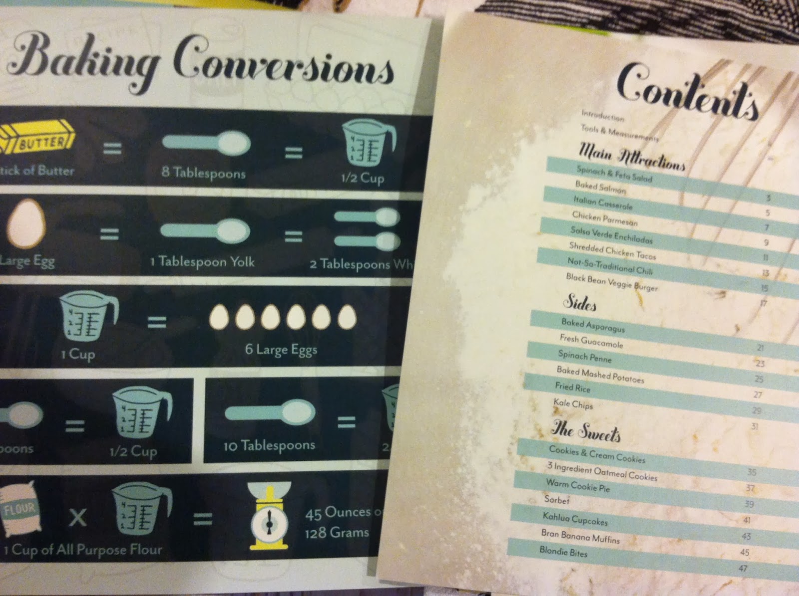
i filled The Kitchen Book with delicious, easy to complete, meals to feed two or more people. lets face it, i'm typically cooking for two people. or four if The Mr. brings his b-ball friends over after practice. i do not need to make enough food to feed 12 servings. and when i do, i can use the conversions chart located at the front of the book (also brilliant, i know).
The Kitchen Book needed to have a variety of choices. a few chicken, seafood, vegetarian. or recipes that can easily be changed to be vegetarian, or vegan. The Mr also hates eating the same types of food multiple days in a row. unless its pizza, burritos, enchiladas or burgers. so this leaves me scrambling to create something that doesn't taste "just like yesterdays dinner". (i love him anyway :)
can i tell you how much i HATE IT when i over (or under) estimate how many people a recipe will feed? well i'll tell you now. i hate it. it forces me to waste food, which i also hate. not everything makes a good leftover meal, unfortunately. so there are times when i only have to make just enough to feed the two of us, which is why each recipe has a serving size listed.
my other favorite part of my book? each entree has a wine pairing. if you're a fellow wine lover, you're welcome. and if you aren't, well. we can still be friends :)
for the health-conscious, i did some research using a website/app (myfitnesspal.com) to calculate the calorie count for each recipe. and left you some space on each card to write your own notes.
and it couldn't have turned out more perfectly !
#proudmomma

.JPG)

.JPG)


No comments:
Post a Comment